American local beer brand design

USA
Catering industry
Initial story
The client is a regional brand from the United States, primarily operating an online store with no physical locations. They emphasize convenience with a delivery service, have a narrow service area, and are involved in the beer business. They are looking to design a brand logo and business cards.
Research & Process
After initially sorting out the design requirements through a questionnaire.
Specify requirements
The customer wants to convey a sense of humor with the phrase "To Be or Not to Be," which is a humorous take on a famous line from a Shakespearean play where a character is contemplating life and death. The comedian slightly alters the line to sound as if he is perplexed or surprised by it. He behaves as if it's not a serious or difficult question but rather something simple and not worth pondering.
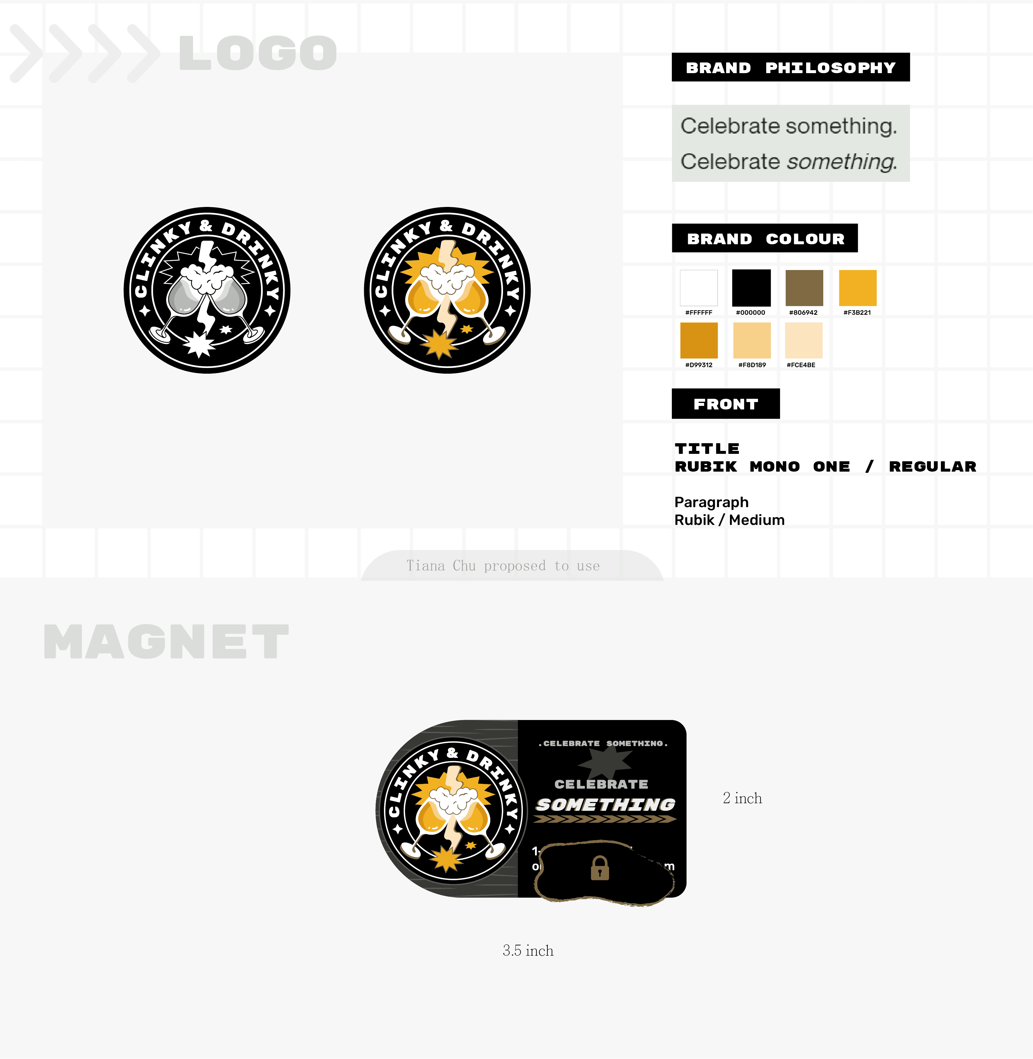
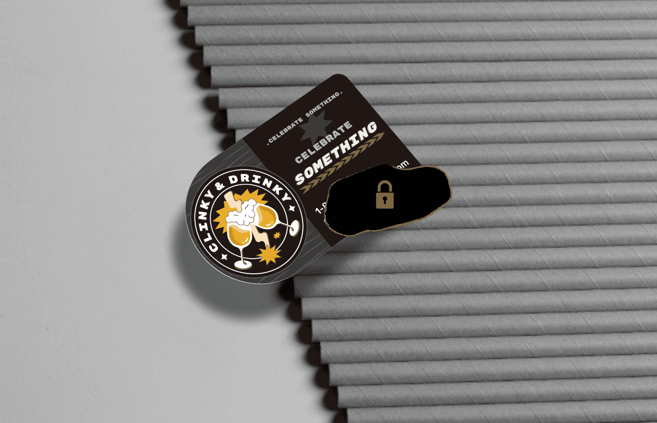
Celebrate Something
- Let's celebrate something.
Celebrate Something
- Actually, there's nothing to celebrate, but let's find something to celebrate anyway.The color scheme is predominantly yellow and black, with a secondary scheme of reversed black and yellow, and a white base paired with black as the secondary color.
Avoid being overly cute or too serious. Keep lines simple and straightforward. Hope to convey a complete communication of this power, feeling resolute as two hands clink glasses, determined not to get drunk and never to return.
Deliverables
Business Cards
Logo
Solution
Hope to convey a complete communication of this power, merging the symbolism of lightning representing a flash of inspiration and impulse with the sense of collision generating strength. Feeling resolute as two hands clink glasses, determined not to get drunk and never to return!
Brand DNA
The brand spirit after combing: Celebrate