


Paradisean — A Pair of Wings on the Sea

USA
Client's Personal Commission Project
1. About the Project
This project is a minimalist logo and brand identity created for a 45’ Seawind sailing catamaran.
The client is a private sailing family centered around life at sea, documenting their journeys and travel stories aboard their vessel.
2. Brief Introduction
Seeking a minimalist brand identity for their new boat, Paradisean.
The name Paradisean is an anagram of the his twin daughters, Aspen and Adria, and also evokes a state of paradise and bliss.
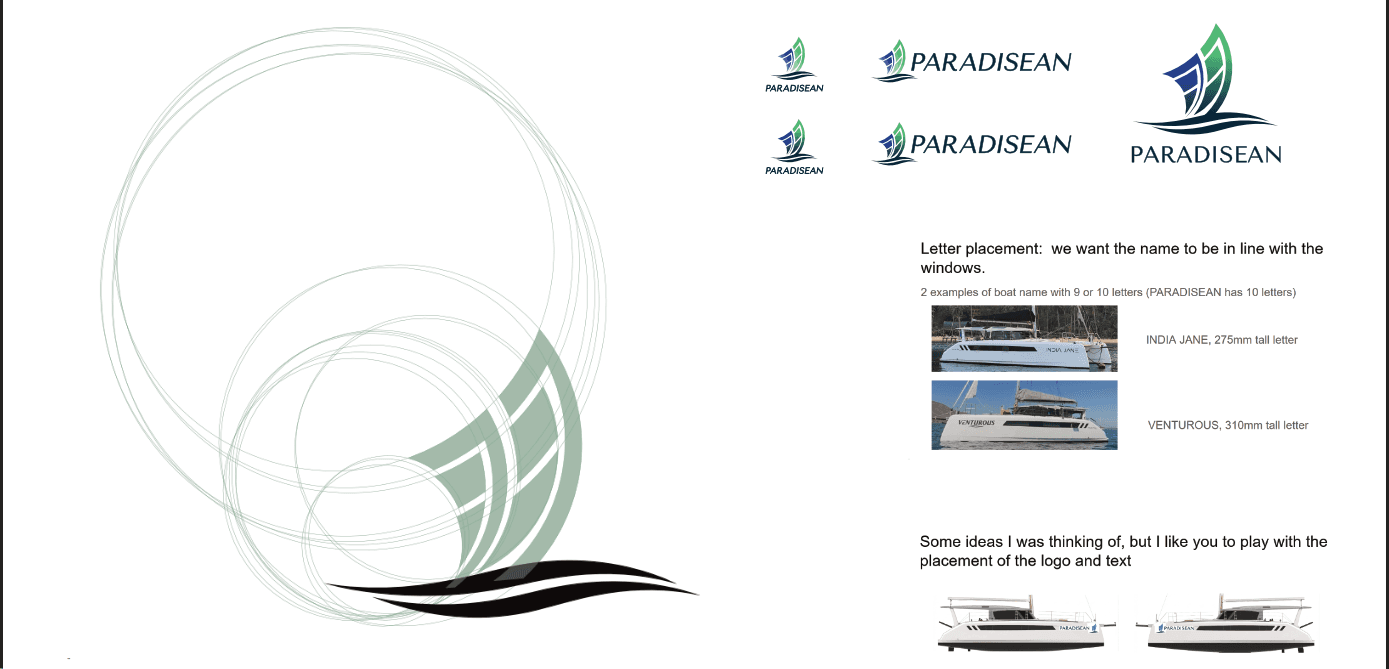
The main goal was to create a highly recognizable mark that could be applied across the boat’s hull, website banner, and social media platforms.
3. Design Process
After a phone consultation to clarify the brand story and usage scenarios.
The design direction focuses on family life at sea, freedom, and a sense of calm in ocean travel.
Key inspirations include:
The dual meaning of Paradisean (family connection and a sense of paradise)
The Bird of Paradise as a symbol of freedom and beauty
The metaphor of wings and movement across the sea
Meaningful Chinese character: 羽 (The Chinese character “羽” carries meanings connected to the daughters’ names and twin identity, symbolizing flight, dreams, and freedom. )

Rapid AI sketches to align on the overall direction with Jack

Logo creation will begin after the direction is confirmed.
4. Visual Elements
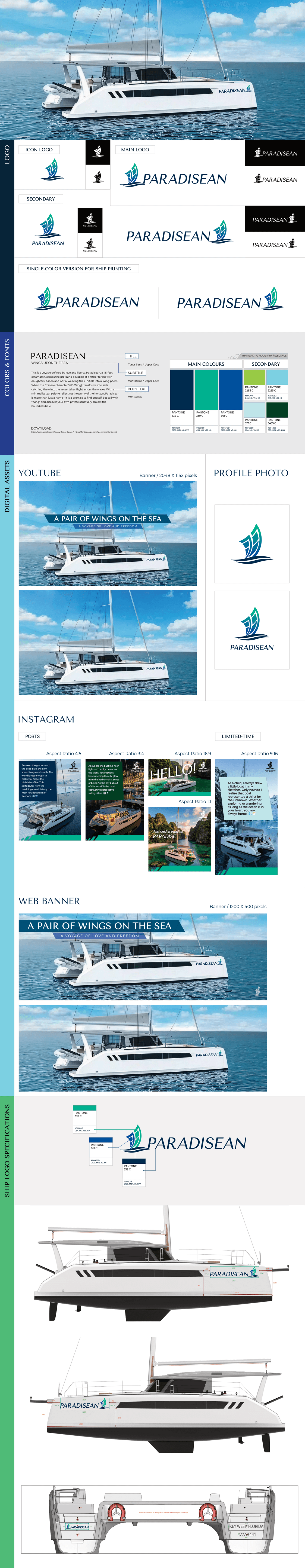
The color palette is limited to a maximum of three tones: blue, green, and either black or grey.
Typography uses a clean and modern sans-serif typeface to ensure clarity and long-distance readability.
The logo is developed using a minimalist geometric approach, incorporating the Chinese character “羽” as the structural form of a sail, symbolizing both wings and navigation at sea.
5. Execution
The brand identity is applied across multiple touchpoints:
Large-scale hull decals for visibility at distance
Website banners
YouTube and Instagram profile assets
The system is designed to remain consistent across both physical and digital environments.
The logo performs effectively in both full-color and monochrome applications.
6. Impact
The final identity successfully translates a deeply personal family story into a cohesive visual system.
It strengthens the narrative of the vessel as a vessel for family life and travel storytelling.
The identity provides a consistent foundation for ongoing sailing documentation and content creation.
7. Collaboration
The designer and client Jack directly communicated requirements and direction through phone consultations.
The client provided the core story, naming background, and usage context.
The designer was responsible for brand strategy, visual translation, and identity development.
8. Challenges
Balancing minimalism with emotional storytelling and a sense of movement at sea.
Translating the Chinese character “羽” into a sail-like structure that remains both symbolic and legible from a distance.
Achieving a balance between cultural symbolism and functional readability.
9. Additional Information
The name Paradisean carries both personal and symbolic meaning, rooted in family identity and linguistic play.
The core concept is inspired by the idea of “a pair of wings on the sea.”
The identity will be implemented across the vessel’s physical hull and ongoing sailing journey documentation.
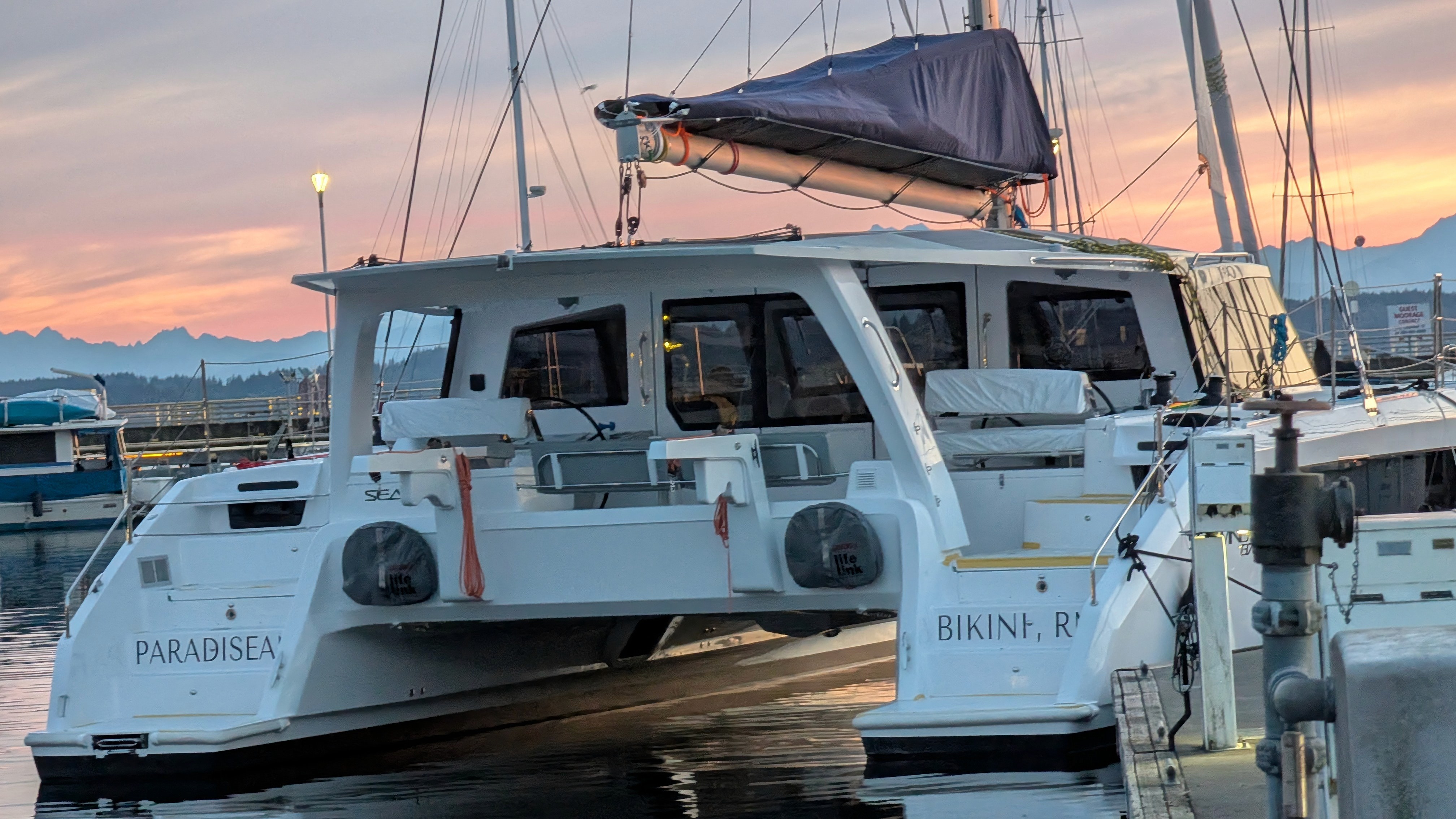

Jack shared photos of the completed boat, offering a glimpse into its construction process and the experiences along the journey, inviting viewers to follow their family’s sailing adventures :D >>>Website

